
UX Research on a Budget: Five Methods That Pay for Themselves
You do not need a research budget to do real research. Five methods that cost hours rather than months, and the questions each one is uniquely good at answering.
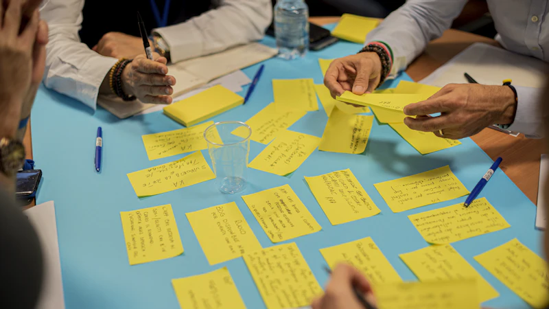
Research has a reputation problem in the agency world.
Either you have a research team and a six-figure study, or you have "no research" and a designer making decisions from instinct. Both are framed as extremes, and both are treated as if the middle — proportionate, cheap, well-targeted research — is not a real option.
It is. Most of the useful research in a design project costs hours, not months, and the methods that cost hours are the ones we use most often.
Start with the decision, not the method
Before choosing a method, write down the decision you need to make. Not "research the users" — that is not a decision, it is an activity.
A useful version sounds like: "Do we build the booking flow as a single page or as four steps?" or "Which of these three onboarding approaches should we test first?" or "Should the pricing page lead with the entry tier or the enterprise tier?"
That framing immediately tells you which method to reach for, and often tells you that you do not need research at all — you need an analytics query or a five-minute conversation with the sales team.
This is worth doing on every project. On a surprising number of projects, the expensive question was never the real question.
Method one: the support ticket review
Cost: one to two hours. Question it answers: what actually breaks?
Go back through six to twelve months of support tickets, sales emails and internal chat messages, and pull out the recurring complaints. This is observational data that already exists, and it is usually the cheapest and most direct evidence available.
What you are looking for is frequency. One person complaining about the export button is an edge case. Forty people complaining about the export button is a finding.
We do this before almost every engagement, and it very often reframes the brief. The feature the client wants built is frequently not the thing causing the complaints.
How to do it: export the tickets into a sheet, tag each with a theme, and sort by count. Expect the top three themes to account for most of the volume, and expect at least one of them to be something nobody on the team mentioned.
Method two: five customer conversations
Cost: three to five hours. Question it answers: what do people think they are doing?
There is a version of user research that sounds rigorous and produces noise, and there is a version that sounds casual and produces insight. The casual version is usually better value.
Ask five to eight recent customers one question: "Walk me through the last time you did X." Then say nothing for a while.
The goal is to hear their language, their sequence and their workaround. Watch for the moment they stop describing what the product does and start describing what they were trying to achieve — that is where the design opportunity usually is.
Do not ask people what they want. People are extremely good at describing features that would not help them, and less good at describing the problem they actually have.
How to do it: recruit from customers or from sales contacts, offer something small for twenty minutes, and record with permission so the team can hear it later. Transcribe the key phrases, especially the awkward ones.
Method three: the five-second test
Cost: thirty minutes for five people. Question it answers: is the hierarchy clear?
Show someone a page for five seconds, take it away, and ask what the page is about and what they would do next.
This tests hierarchy, not comprehension in detail, and it is very good at detecting one specific failure: an unclear value proposition. If five people cannot say what the page is for after five seconds, no amount of copy editing below the fold will fix it.
It is also excellent for comparing two or three directions quickly, before you invest in polishing any of them.
How to do it: no instrumentation needed. Open the page, count five seconds, close it, ask the two questions. Do it for each candidate direction.
Method four: the moderated usability session
Cost: three to four hours including recruitment. Question it answers: where do people actually get stuck?
This is the most familiar research method, and the most misused. The mistake is asking people to review. Review invites politeness and general approval. Task-based testing invites truth.
Give someone a realistic task with a realistic goal — "find out whether you can change your plan before the renewal" — and watch. You are not testing them. You are watching the interface.
Things worth noting: where they hesitate, what they read twice, what they click expecting something else, and the point where they stop and start guessing. That last one is where the real information is.
How to do it: five participants is usually enough to find the obvious blockers. Write the task so it cannot be completed by reading the screen aloud — a real task requires a real decision.
Method five: the diary study
Cost: a week of participant effort, very little of yours. Question it answers: what happens outside the product?
Some of the most important context lives outside your product entirely. A competitor's pricing page, a spreadsheet, a phone call to support, a screenshot someone pasted into a chat message. No usability session will find these, because they happen in the customer's environment.
A diary study asks a small number of people to send you a screenshot or a short note each time they do the thing you care about, for a week or two.
How to do it: keep it tiny. One screenshot and one sentence, once or twice a week, for ten participants. You are looking for the unexpected context — the workaround, the printed spreadsheet, the workaround that the product does not know about.
What this is not
None of these replace a serious study, and we should be honest about the limits.
- Small samples find usability problems, not market segments.
- Five conversations cannot establish a market size or a willingness to pay.
- These methods do not replace analytics for anything measurable at scale.
- None of them will tell you what to build. They will tell you what you do not understand yet.
What they do is close the gap between a brief written by assumption and a brief written by evidence — and that gap is where most of the expensive mistakes live.
A two-week research sprint that fits almost any budget
Day 1–2: Review support tickets, sales calls and analytics. Write down the top five recurring problems. This alone often reorders the roadmap.
Day 3–4: Five customer conversations. Transcribe and extract their language.
Day 5: Five-second test on the current site and on the main alternative. One line each for what it is and what to do.
Day 6–7: Three moderated sessions on the riskiest flow, if there is one.
Day 8–9: Review and write up. One page per finding: the evidence, what we think it means, what we recommend.
Day 10: Present to the team. Agree what changes in the brief.
Ten working days, no dedicated research team, and a brief that is dramatically more accurate than the one you started with.
The part that matters most
The output is not the research. It is the decision it changes.
Research that does not alter a single decision is an expensive way to feel informed. We write up findings with a recommendation attached, and we make sure the team sees which decisions moved as a result. That is what makes the work worth doing again next quarter.
If you are starting a project and want a proportionate research plan rather than a maximal one, talk to us — our UI/UX and product design engagements begin with exactly this kind of sprint.
Keep reading
Related articles
Colour Psychology in B2B Brand Design
Colour meaning is real but overclaimed. What actually happens when a buyer meets your palette, why B2B colour decisions go wrong, and how to choose…
Mobile-First Web Design in 2026
Mobile-first stopped being a strategy and became a constraint. What that means for layout, typography, navigation and performance now that almost…
Landing Page Copy and Design That Work Together
A landing page is not a poster and a paragraph. When copy and layout are designed as one thing, the page stops needing to explain itself. Here is how…
Next step
Have a problem like this one?
Tell us about it. We will tell you honestly whether design is the right lever.