
Mobile-First Web Design in 2026
Mobile-first stopped being a strategy and became a constraint. What that means for layout, typography, navigation and performance now that almost everyone arrives on a phone.
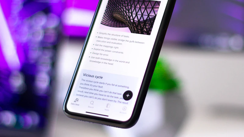
Mobile-first stopped being a strategy some time ago. It is now a constraint, in the same way that a fixed viewport width is a constraint: you do not argue with it, you design inside it.
The reason is not that phones are popular. It is that the majority of traffic to almost every site now arrives on a phone, on a mid-range device, on an imperfect connection, often while the person is doing something else.
That combination changes more than layout. It changes what you can assume about attention, what you can afford to load, and what a page has to accomplish.
The two constraints that actually bind
Everything else follows from these.
Constraint one: the connection is not good, and the device is not fast
Design decisions about hierarchy, density and load weight are really decisions about a phone on 4G in a car park.
The practical consequence: every kilobyte and every render-blocking resource is a real tax on a real conversion. This is why the performance work and the design work are the same work.
Constraint two: attention is fragmented and the context is unknown
The person is not at a desk with a large monitor and time to explore. They are on a phone, possibly on the move, possibly looking for one specific thing.
The consequence: the page has to work in a single glance. If the value proposition is not clear without scrolling, it will not be read.
What this changes in practice
Layout: one column, then four
Mobile-first is not "the desktop layout, squeezed". It means the layout is designed as one column with a clear reading order, and the multi-column layouts are additions that use the extra width.
That is not only about space. A desktop grid invites a browsing relationship — look here, then there. A phone cannot support it, so if the design requires it, the phone version will be a compromise.
The reverse is not true. A design that reads well as a single column usually becomes a good desktop layout, because the hierarchy was already established before any columns appeared.
Typography: bigger than feels right
Body text on a phone should be around 16px minimum, and 17–18px is better for reading-heavy content. Line height around 1.6 for body copy, and generous spacing between blocks.
The instinct to shrink type to fit more on screen is the opposite of correct. A phone screen has plenty of vertical space; the scarce resource is attention, and small text spends attention without buying anything.
Headings need to survive being read at arm's length, outdoors, in a hurry. This is why our display type scale is fluid and generous rather than tuned for a 1440-pixel canvas.
Navigation: fewer items, and search where it earns its place
The desktop mega-menu with seven columns and forty links is not a phone pattern. On a phone you get a short list of the four or five things a customer might actually want, plus a way to get to everything else.
Where a site has genuinely large content — a catalogue, a blog, a directory — search is worth building. Where it has eight pages, search is a worse experience than a list.
Our rule of thumb: the navigation should contain what 90% of visitors need, and everything else should be reachable within one more step.
Touch targets: 44 pixels, not 40
Minimum comfortable touch target is 44×44 CSS pixels. This is larger than most designers assume, and it is the difference between a tap that lands and a tap that misses.
Adjacent targets also need spacing. Two buttons with 8px between them produce mis-taps that show up as support tickets about the wrong thing being selected.
Forms: fewer fields, better defaults, no typing where possible
Autocomplete attributes, correct input types, appropriate keyboards. A phone keyboard is the slowest input method there is, so every field you remove is a real saving.
Splitting a long form into steps helps on mobile. It also helps on desktop, which is why so many desktop forms that work fine are unnecessarily long.
Images: the right file, at the right size, for the device that asked
<srcset> with sensible breakpoints, modern formats, explicit dimensions so nothing shifts while loading, and lazy loading for everything below the fold.
The single most common mobile performance failure we see is a 2000-pixel hero image served to a phone. It is not a subtle problem. It routinely costs two seconds of LCP on exactly the devices that need the help most.
Performance budgets belong to the mobile case
We set budgets against a mid-range device on a throttled connection, not against a developer's laptop on office wifi. That produces a site that is fast for everybody, rather than a site that is fast for the people building it.
The desktop question people actually ask
"Do we even need a separate desktop design?"
Sometimes yes, and it is worth being clear about why. A wide viewport does not just give you more columns — it changes the reading distance, the line length, the navigation model and the amount of content a person can hold in view at once.
The right approach is not two designs. It is one system with a fluid scale, where the desktop layout is the natural extension of the mobile one.
What you should avoid is designing the desktop first and then reflowing it down. That is the old way around, and it produces the classic result: a phone layout that feels like a squeezed desktop, with a hamburger menu containing items that never needed to be in a menu.
What to check on your own site
You can do most of this in an afternoon.
- Open it on a real mid-range phone — not a simulator on a flagship device. Not your own phone if it is two years old and fast.
- Throttle the connection and watch what loads first.
- Time to first meaningful interaction. Not load time — the time until you can do the thing you came to do.
- Try the main form on the phone. Count the fields. Check the keyboards are right. Check autocomplete works.
- Tap every interactive element and check for mis-taps.
- Read only the first screen and ask what the page is for.
- Check every image for whether the phone is downloading a file bigger than the screen.
- Turn on reduced motion and check the site still works.
The honest summary
Mobile-first is not a visual style. It is a set of constraints — bandwidth, screen size, attention, context — that push you toward fewer things, loaded faster, clearer.
A site built inside those constraints is usually better on desktop too, because hierarchy that survives a small screen is hierarchy that works anywhere.
The failure mode we see most is the opposite: a desktop site that was never designed for a phone, converted to a phone version late, and shipped with a hamburger menu containing the entire site.
If your mobile experience is where you are losing people, that is often a smaller job than it looks — but it has to be done as a system, not as a template. Our web design practice covers it, and if the underlying issue is speed rather than layout, SEO and growth is where that starts.
Keep reading
Related articles
Colour Psychology in B2B Brand Design
Colour meaning is real but overclaimed. What actually happens when a buyer meets your palette, why B2B colour decisions go wrong, and how to choose…

UX Research on a Budget: Five Methods That Pay for Themselves
You do not need a research budget to do real research. Five methods that cost hours rather than months, and the questions each one is uniquely good…
Landing Page Copy and Design That Work Together
A landing page is not a poster and a paragraph. When copy and layout are designed as one thing, the page stops needing to explain itself. Here is how…
Next step
Have a problem like this one?
Tell us about it. We will tell you honestly whether design is the right lever.