
Landing Page Copy and Design That Work Together
A landing page is not a poster and a paragraph. When copy and layout are designed as one thing, the page stops needing to explain itself. Here is how to build them together.
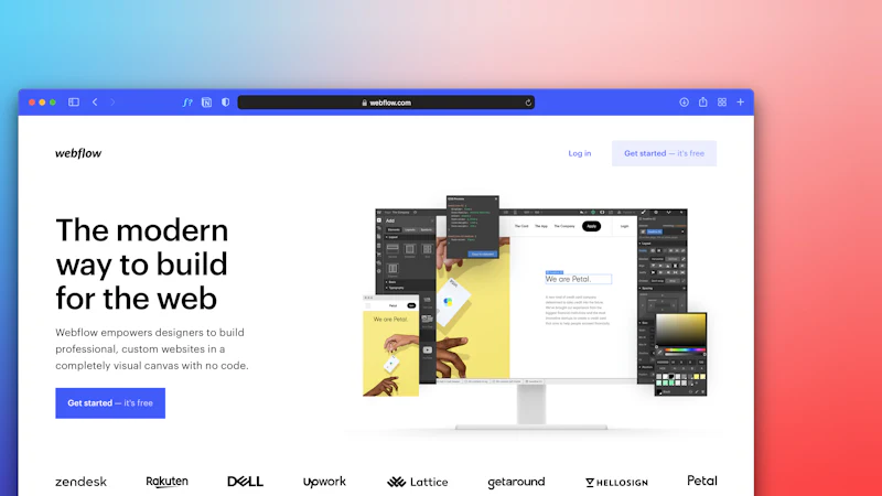
Landing pages fail in a specific way that is easy to miss if you only look at the copy.
They fail because the copy is written for a reader and the layout is built for a layout.
A designer produces a beautiful structure with slots for words. A writer fills the slots. The result is a page where every section is well designed and none of them connect — a set of panels rather than an argument.
The fix is not better writing. It is designing the page as a single piece of communication, where each block exists to answer one question and the questions have an order.
The three questions a landing page answers
Every landing page a visitor lands on is trying to answer three things, and the order in which it answers them determines whether it works.
1. Is this for me? This is the question that gets asked first, usually in under five seconds, and it is not asked consciously. It is answered by the combination of the headline, the visual and the immediate context.
2. What do I get? Not the features — the outcome. "Reduce your monthly close from five days to one" is an outcome. "Automated reconciliation" is a feature. The visitor does not care about the feature until they believe the outcome.
3. Why should I believe you? Evidence. Case studies, numbers, named clients, a clear process, a specific guarantee. This comes after the outcome, not before it, because evidence without an outcome is noise.
4. What happens next? The action, and what it costs them to take it. Most landing pages put this last, which is right, but then make the last step ambiguous — "Submit" with no indication of what happens, how long it takes, or whether they will be sold to.
The structure of a landing page is the order of these questions. Everything else is decoration.
Design the order before the layout
The most common structural mistake is putting proof before payoff.
The pattern reads: big logo, "Trusted by 500+ companies", five client logos, a headline, some features, a pricing table, a contact form.
The visitor does not yet care that you are trusted. They have not decided this is for them. Leading with social proof is asking for trust on credit, and credit is not granted.
The pattern that works: a headline that names the outcome and qualifies the reader, one sentence of supporting detail, then the single most persuasive piece of evidence, then the mechanism, then the proof, then the action.
Headline — the outcome, for a specific reader
Subhead  — what it is and who it is for, in one sentence
Hero image or product — the thing itself
Primary CTA + reassurance — one action, one line of why it is safe
Problem / mechanism — why this works when the alternative does not
Proof — case study, numbers, named client, process
Secondary proof — logos, review quotes, awards
Objection handling — the three questions they did not ask aloud
Pricing or scope — transparent, with what is included
Final CTA — the same action, repeated
Notice there is exactly one primary action repeated, not five different ones.
Write real copy into the layout, not into placeholders
This is the single most damaging habit in landing page design, and it is nearly universal.
Lorem ipsum produces a layout with the wrong rhythm. Placeholder text of the wrong length produces a layout that will break the moment real copy arrives, and the team discovers this two days before launch, when the fix is to cut a sentence rather than to restructure a page.
The correct sequence is:
- Write the actual copy first, or at least a realistic draft of it.
- Build the layout around that copy.
- Design the components so they hold up under the real length and the real hierarchy.
Real copy has a shape. It has a long headline and a short one, a subhead that needs two lines, a list item that runs to three lines. Designing with that shape present is the whole point.
If the copy genuinely is not available yet, write it yourself. A rough draft from the designer or strategist is more useful than lorem ipsum, and it exposes the structural problems early, while they are still cheap to fix.
The copy must carry the design's hierarchy
A good layout has an obvious reading order. If the copy does not follow it, the reader has to choose, and most will not.
Practical rules:
- One idea per section. If a section has two ideas, it needs to be two sections or a different section.
- The heading is the conclusion. Not a label. "Reduce month-end close to one day" rather than "Month-end close".
- Shorter is not always better, but a sentence that has to be re-read is a sentence that fails.
- Specifics beat adjectives. "48-hour launch" beats "fast delivery". "From $499, one-time" beats "affordable".
The CTA is a design element, not a button
The call to action is where most landing pages leak.
Say what happens
"Submit" tells the visitor nothing. "Get my free quote" tells them what they get. "Book a 20-minute call" tells them what it costs in time and what they will get for it.
Remove the surprise
Anything that appears after the click should be anticipated. If a form is going to ask for nine fields, the visitor should know that before they start. If there is a price range, say so. If somebody will call them, say when.
Make it look like the most important thing on the page
There should be exactly one primary action style per page, and it should be used on the primary action only. A page with four pink buttons has none.
This is the same principle as the palette discipline in a design system: when a colour means "important", it cannot mean everything.
Repeat it
The action should appear at the natural end of the argument, and once before that — usually in the hero, and once more after the proof. Three placements is plenty for most pages.
Reassure beside it
Next to the button: what happens next, how long it takes, whether it costs anything, and what happens to their data. One line. This addresses the objection that stops people clicking more effectively than any amount of persuasion above the fold.
Handle the objections you did not get asked
The questions a serious buyer asks but does not type into a form. They are usually about risk, effort and timing:
- How long will this take?
- What do I have to do?
- What if I do not like it?
- Is this going to be expensive later?
- Who else works with people like me?
A landing page that answers three of these has done more for conversion than a page with a much better hero image. We usually add a section between the proof and the pricing, or fold the answers into the proof itself.
Test the page as a whole, not element by element
Landing page tests fail when they test one component. A button colour will not move the number, and optimising it anyway is how teams spend a quarter making no difference.
What moves the number is usually one of:
- The headline — whether it names the right outcome for the right reader
- The information order — whether proof appears before or after the payoff
- The clarity of the offer — what they get, for whom, at what price
- The action — whether it is singular, specific and low-risk
Test those, in that order.
The working checklist
Before a landing page ships, we check:
- Does the headline name an outcome for a specific reader?
- Does the subhead say what it is and who it is for, in one sentence?
- Is there exactly one primary action, repeated, with a clear label?
- Is the reassurance next to the button?
- Does the proof appear after the payoff rather than before?
- Are the three most likely objections answered?
- Is the price or scope transparent?
- Is the real copy in the layout, not placeholders?
- Does the page work on a phone, with real copy, at real length?
- Is the form asking only for what is needed to take the next step?
If those are true, the page is usually fine. Most of the time, the landing pages that convert badly are not suffering from a design problem. They are suffering from a copy problem that the design is faithfully transmitting.
If your landing pages are not converting and you are not sure whether the problem is the copy or the layout, that is a conversation we enjoy — and if the answer turns out to be a full site rebuild, our web design practice covers it.
Keep reading
Related articles
Mobile-First Web Design in 2026
Mobile-first stopped being a strategy and became a constraint. What that means for layout, typography, navigation and performance now that almost…
Colour Psychology in B2B Brand Design
Colour meaning is real but overclaimed. What actually happens when a buyer meets your palette, why B2B colour decisions go wrong, and how to choose…
UX Research on a Budget: Five Methods That Pay for Themselves
You do not need a research budget to do real research. Five methods that cost hours rather than months, and the questions each one is uniquely good…
Next step
Have a problem like this one?
Tell us about it. We will tell you honestly whether design is the right lever.