
Design Systems That Survive Contact with Engineering
A design system is a bet that two teams will keep agreeing after the project ends. Most fail at the handover. Here is the structure we use to make systems stick.
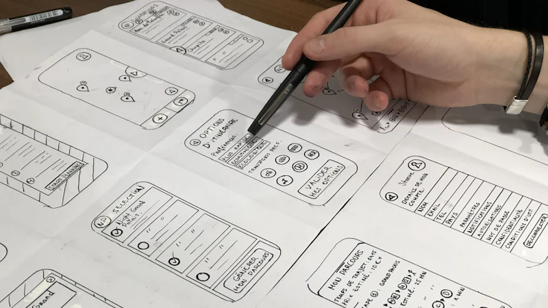
Most design systems do not fail at the design stage. They fail about four months after handover, when the person who built it has moved on and two teams are making contradictory decisions with the same components.
The components are still there. They are just being used in ways nobody anticipated, and there is no document that explains what the correct usage is or who decides when the system changes.
This is not a design quality problem. It is an organisational one, and it has to be solved with structure rather than with more polish.
The failure modes we keep seeing
The component exists but the pattern is missing
A library gives you a button. It does not give you an answer to "where does this button go, what does it sit next to, and what happens when the user is in a particular state".
Designers re-derive those answers every time, and they derive them differently every time. The result is six slightly different product pages built from the same component set, which is the specific outcome a design system was supposed to prevent.
The tokens exist but nobody knows they are the source
The colour, spacing and type tokens live in a file that the design team maintains and the engineering team has never seen. Engineers hard-code the hex value. Six months later there are two truths, and the style guide describes a third.
The documentation is a museum
The library is beautifully documented and nobody reads it, because the documentation is a description of what exists rather than an explanation of how to decide. Documentation that only records the obvious gets skipped.
Nobody owns it
There is no named owner, so every change request becomes a debate and every decision becomes inconsistent. If the answer to "can we add a new button variant" is "whoever is free this week", the library will be different every quarter.
The structure that works
Layer one: primitives, with names that mean something
Primitives are the raw values: colour, spacing, type scale, radius, elevation, motion duration.
The critical rule is that a primitive name describes its role, not its appearance. surface-raised is durable. white-2 is a liability that will outlive its meaning.
A token set that is organized by role rather than by value is what makes rebrand possible. If everything is gray-100 and blue-500, a rebrand is a thousand edits. If everything is text-primary, surface-raised and accent-interactive, a rebrand is a handful of decisions.
We typically produce three layers:
- Primitives — the raw palette and scale.
pink-500,space-4,radius-lg.
- Semantic tokens — the role-based layer.
accent-interactive,text-muted,surface-raised.
- Component tokens — the per-component layer.
button-primary-bg,button-primary-label.
Engineers consume layers two and three. Only the brand team ever touches layer one.
Layer two: components with their states specified
A component is not done when it looks right in Figma. It is done when every state is defined:
- default, hover, focus-visible, active, disabled
- loading, empty, error, partial
- long content, no content, unexpected content
- light and dark, if both exist
Most handover disputes are actually state disputes. Someone implemented a hover state that was never specified and it is now part of the product's behaviour.
Layer three: patterns, which is where the real value is
Components are atoms. Patterns are the arrangements that carry meaning: a form, a pricing table, an empty state, a page header, an onboarding sequence.
This layer is the one that stops six teams reinventing the same onboarding flow, and it is consistently the one that gets skipped because it is harder to build and harder to keep current.
Layer four: decision rules, written as sentences
This is the layer almost nobody does, and it is the difference between a system that is used and a system that is bypassed.
A decision rule says what to do in a specific situation:
Use a primary button once per view, for the action you most want the customer to take. If two actions compete, the second one is a ghost button. Never place a primary button in a footer, where there is no competing context and every button looks equal.
When a form has more than seven fields, split it into steps. Long forms on mobile lose completion at a predictable rate, and the fix is structural rather than visual.
These sentences are what a designer reads at the moment of decision — which is exactly when a library of components is least helpful. They are also cheap to write and cheap to maintain, because they change far less often than components do.
Layer five: governance with a named owner
Someone has to be able to say yes and no. Without that, every proposed addition becomes a fork in the system.
The model we recommend:
- A named owner for the system, usually a design systems lead with engineering support.
- A monthly review of proposed additions, with a short decision log.
- A contribution path for teams outside the core group — usually a pull request against the library with a review, rather than a direct edit.
- A documented versioning approach, so consumers know what changed and when.
The contribution path matters more than it sounds. Systems that only the core team can change generate resentment, and resentment shows up as quiet divergence.
Documentation that gets read
Documentation dies when it becomes a mirror of the library. The library already shows you the components. Documentation should explain the reasoning.
A useful documentation set:
- Principles — the three or four rules that explain most decisions.
- Decision rules — the sentences above, organised by context.
- Anti-patterns — what not to do, and why. This is disproportionately useful, because most misuse is unintentional.
- Migration notes — what changed in each version, and how to adopt it.
- A single example per pattern, showing it assembled correctly in context.
Keep it in the same place as the library. A separate documentation site that lives separately from the tool will fall behind within a quarter.
The measurement that actually predicts survival
We do not measure design system adoption by counting components used. That number always looks good and tells you nothing.
The number that predicts survival is: how often does someone need a decision that the system does not answer?
If engineers and designers are constantly raising questions the system has no answer for, the system is not capturing the organisation's decisions. It is a component library with good documentation, which is useful but is not the same thing.
A practical way to track it: keep a log of design decisions raised in reviews. Every question the system cannot answer is a gap. Close the gaps, and the system starts to pull its own weight.
Where to start if you have nothing
Do not start with tokens. Start with the product that hurts most — usually the one with the most teams touching it — and build the three or four components that cause the most conflict. Then write the decision rules for those components, because that is where the value is per hour spent.
A system that covers one product properly beats a system that nominally covers everything and is bypassed in the first month.
If your organisation is in that position — components exist, decisions do not — that is usually a design systems engagement rather than a build-out. We are happy to look at what you have and tell you honestly whether it needs rebuilding or just better rules.
Keep reading
Related articles

Before Black Friday, Fix the Decisions Your Store Makes Difficult
A customer clicks an ad promising 30% off, lands on a product page, and sees the original price. Perhaps the discount appears in the cart. Perhaps it…
Next step
Have a problem like this one?
Tell us about it. We will tell you honestly whether design is the right lever.